
How to Choose the Right Colors for Home Decor Trends
Which colors can you paint with today without regretting them by next spring? The personal home decor trends worth betting on are warm, earthy and muted: greige, sage, clay, deep navy and soft white with black accents.
Below are nine pairings, each with the undertone logic behind it, the room it suits and the mistake to dodge. Paint names are examples, so swap in the closest match from any brand.
The color logic behind great personal home decor trends
Every current palette comes down to undertone. A beige with a pink base fights a gray sofa with a blue base, and no amount of styling fixes that. Choose the undertone first, then the color.
Light decides the rest. North-facing rooms pull everything cooler and flatter, while south-facing rooms push colors toward yellow by mid-afternoon. These nine pairings account for both.
Greige walls with an oatmeal bouclé chair
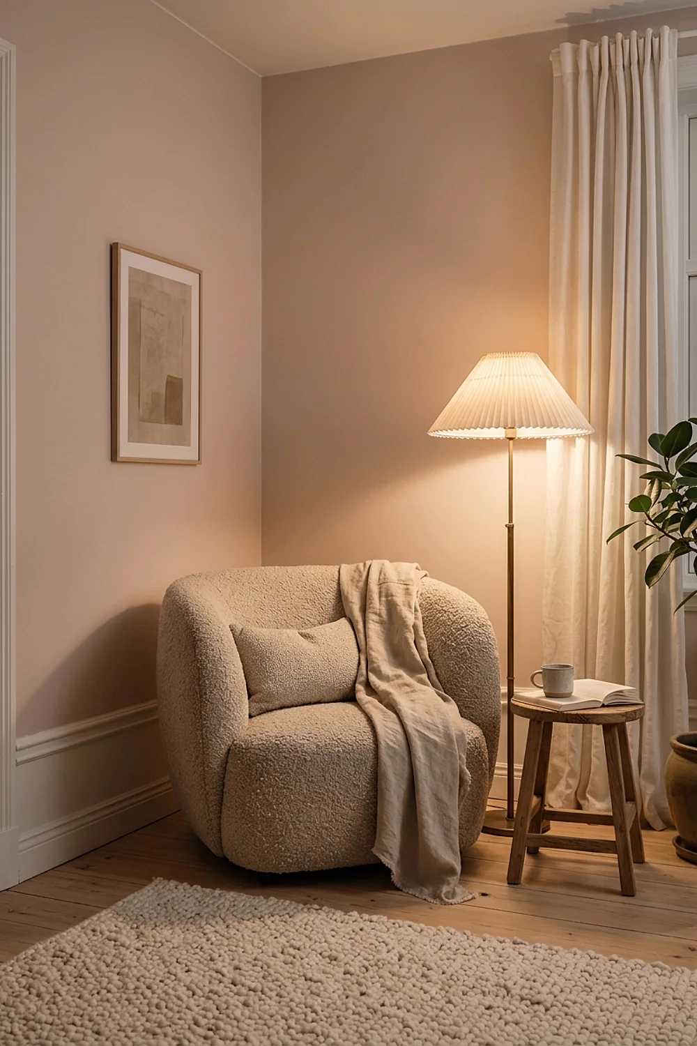
A bouclé chair in oatmeal looks washed out against stark white, but it gains depth against Sherwin-Williams Accessible Beige, which has a light reflectance value around 58. The nubby texture catches shadow and the wall gives it something to push against.
Personal home decor trends lean toward this softened neutral because it suits north-facing living rooms that need warmth without turning yellow. Skip it if your flooring is orange-toned oak, since the greige will read cold beside it.
Sage green beside honey-toned wood
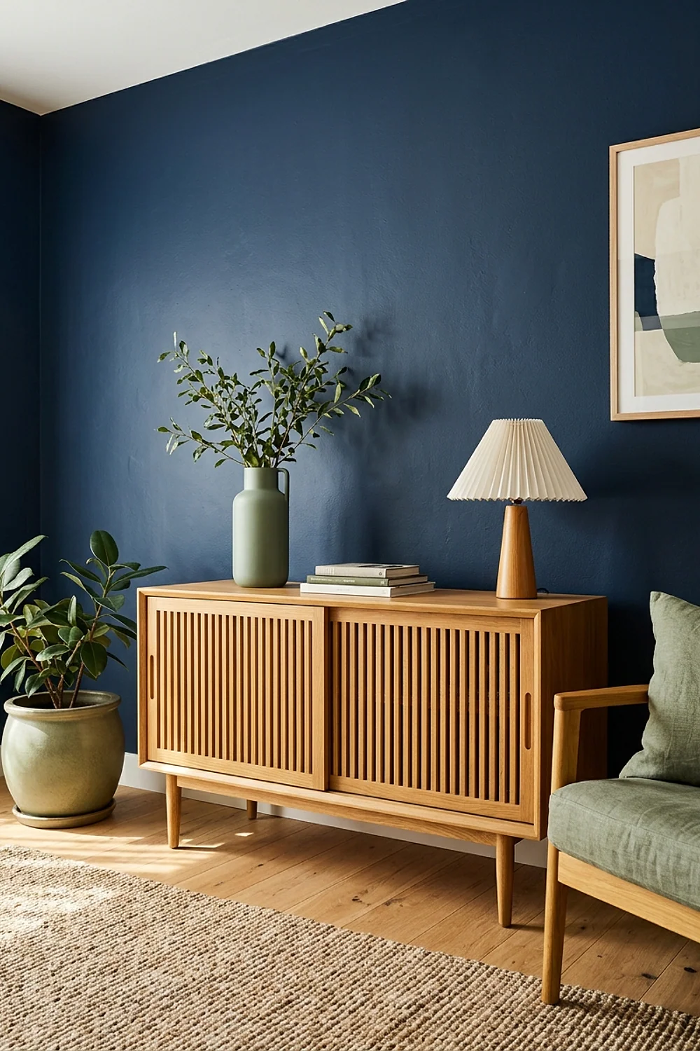
Put a soft sage such as Benjamin Moore October Mist on the wall opposite the window, and keep the oak or walnut furniture on the window side. Daylight bounces off the wood onto the green, so the color shifts through the day instead of sitting flat.
This works best in dining rooms and open-plan living areas. A Behr color-match of a designer sage runs about $30 a gallon against $85 for the original, and the finish difference is invisible on a wall.
Terracotta behind the bed, cream everywhere else
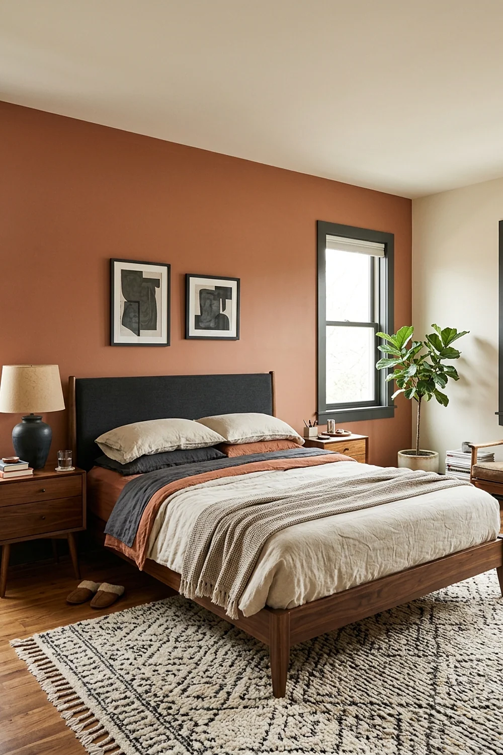
Sherwin-Williams Cavern Clay on the single wall behind a headboard wraps the sleeping area in warmth. Cream linen bedding in something like Benjamin Moore White Dove keeps the clay from swallowing the room.
Stick to one wall in any bedroom under 120 square feet. Four clay walls in a 10 by 10 room feel like a closing hand at 9pm, which is the opposite of restful.
Navy and brass under warm bulbs
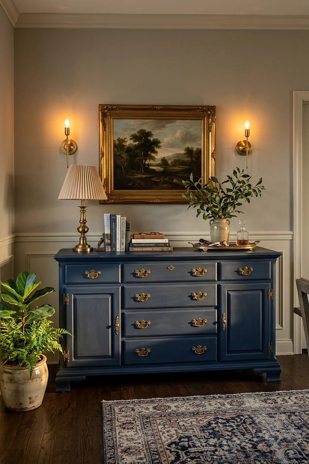
At 4pm in a dining room, a navy like Benjamin Moore Hale Navy turns almost inky as the sun drops. Brass fixtures and 2700K bulbs pull the blue toward warm and keep it from going cold.
This pairing is for rooms used mostly at night. Avoid 4000K or 5000K bulbs here, because they turn navy into a flat, slightly purple blue.
Black frames on soft white walls
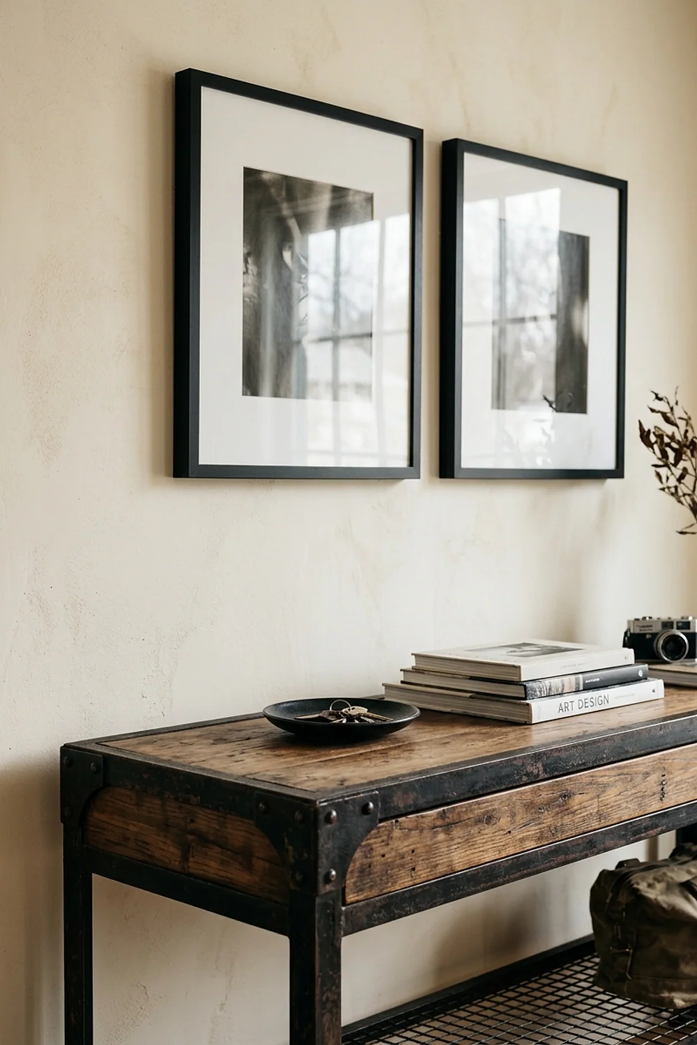
Black picture frames about 1 inch wide on a warm white wall give a room structure that color alone can’t. White Dove-style whites carry a faint cream undertone, so the black reads soft instead of harsh.
It suits renters and anyone who changes art often, since the wall stays neutral. Stay away from stark, blue-leaning whites, which make black frames look like office furniture.
Charcoal powder room with a blush towel
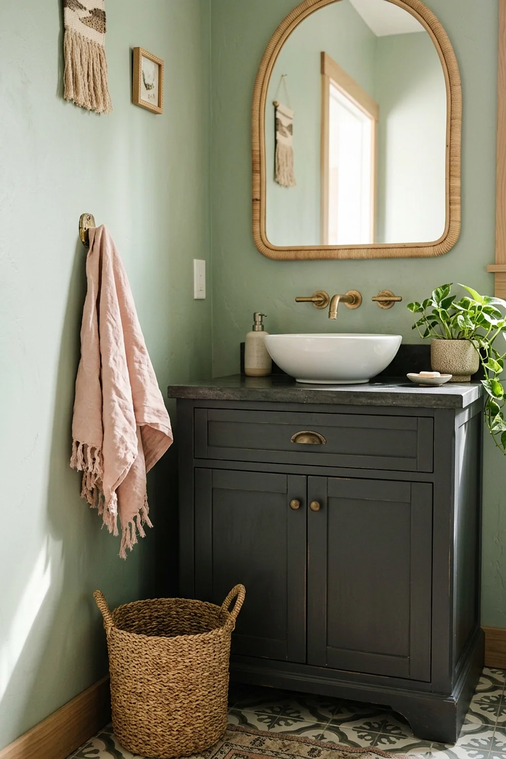
Conventional advice says small rooms need light colors. That backfires in a powder room under 30 square feet, because pale paint just highlights how tight it is. Benjamin Moore Kendall Charcoal makes the corners disappear and the room reads as a deliberate jewel box.
Add one blush hand towel and a mirror with a thin metal frame. A quart covers a small powder room for roughly $28, so a bold experiment costs less than a single throw pillow.
Mushroom taupe walls with an olive rug
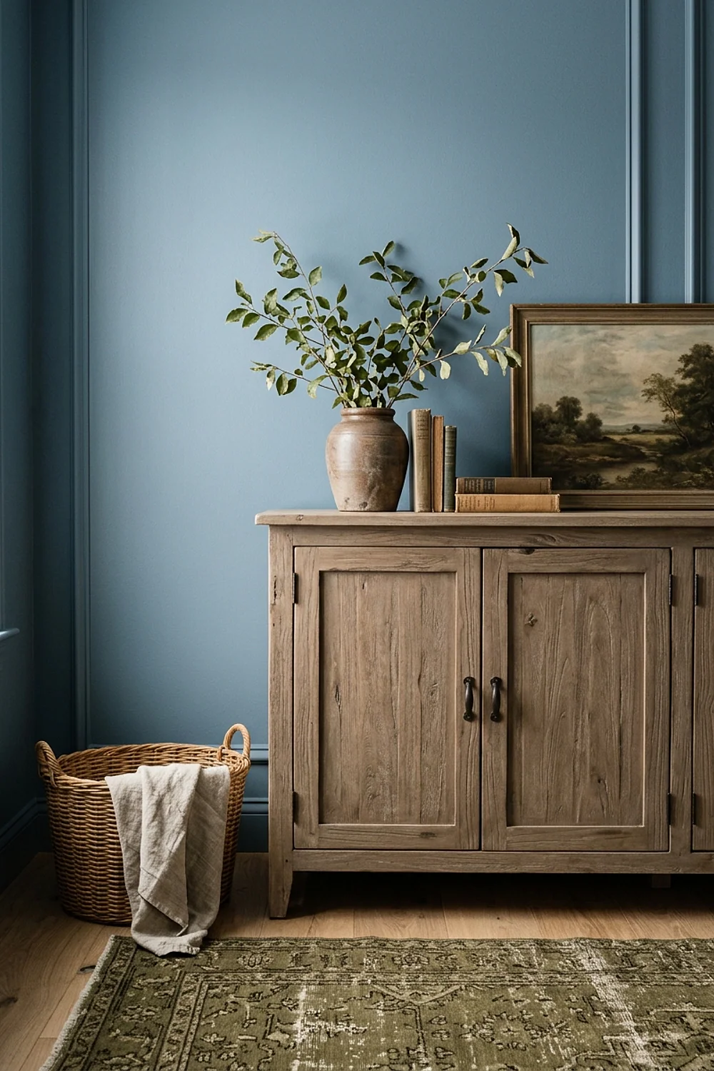
An 8 by 10 rug in olive wool anchors a mushroom-taupe room better than a pattern does, because the large, quiet block of color sets the scale. Smaller 5 by 8 rugs make the same room feel like it’s floating.
This pairing suits living rooms of 200 square feet or more. In small rooms, go with a lighter olive so the rug doesn’t dominate the floor.
Wythe Blue built-ins with open shelves
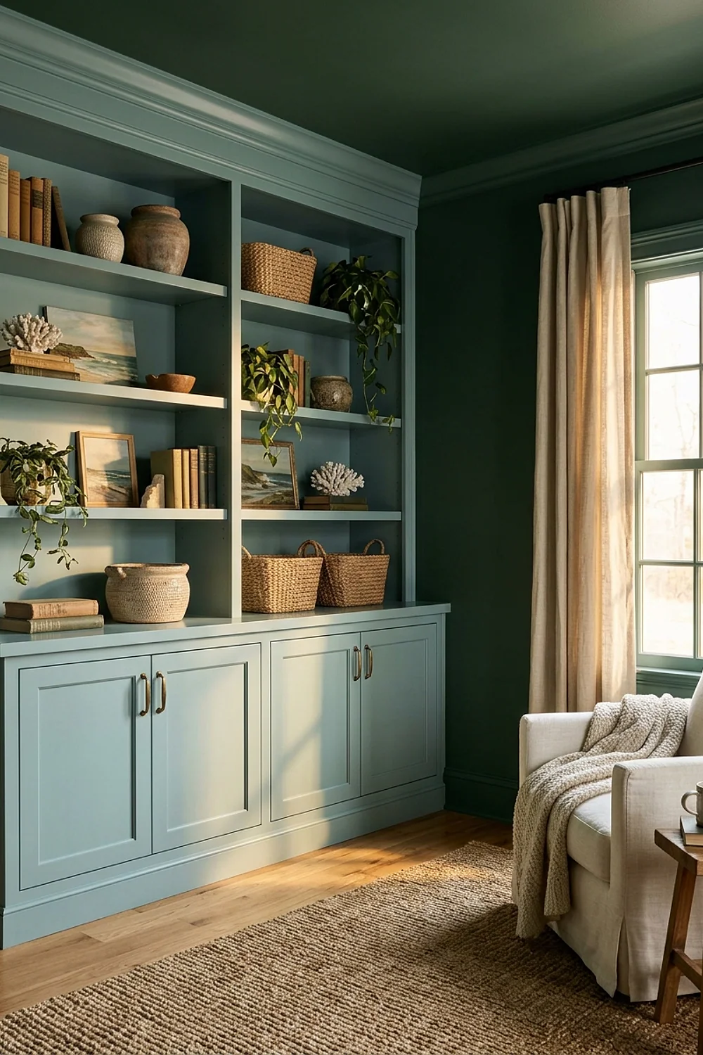
Painted bookcases in a dusty blue like Benjamin Moore Wythe Blue turn plain storage into a feature. Books and ceramics sit against color instead of raw white, so even a messy shelf looks intentional.
The approach fits alcoves and the space around a fireplace, where a shelf unit 12 inches deep is normal. Use a satin or semi-gloss finish, because flat paint scuffs the moment a book gets pulled out.
Urbane Bronze office with mustard accents
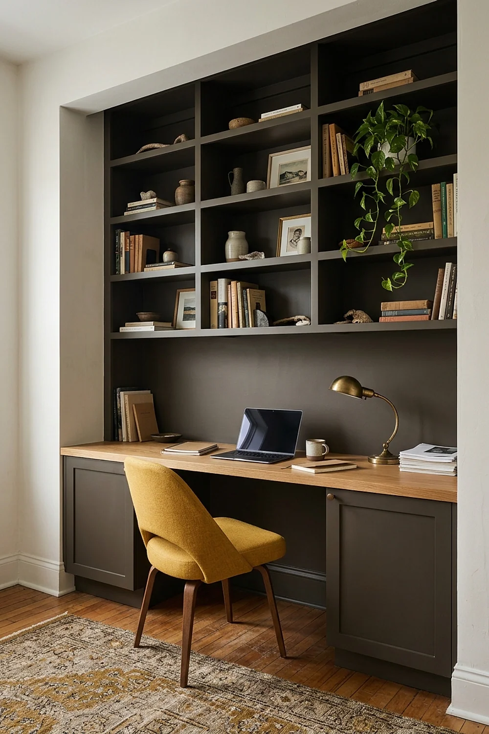
A home office wall in Sherwin-Williams Urbane Bronze, a dark brown-gray, works hard on video calls. The deep, muted color gives the camera a steady backdrop that makes skin tones stand out, and matte paint cuts glare behind your head instead of bouncing light into the lens.
A mustard lamp or chair keeps the dark from feeling heavy, since the warm yellow lifts the brown-gray undertone. This suits anyone working eight hours a day in one room.
Don’t use gloss here, since it throws window reflections into the camera.
Testing colors before you commit to personal home decor trends
Never judge a color from a 2-inch chip. Paint a 2 by 2 foot patch on two different walls, then check it at 8am, 4pm and 9pm. On a gray November afternoon, a warm beige can look like putty.
- Use an 8-ounce sample pot, about $6, instead of a $90 gallon you might regret.
- Paint a large sheet of poster board, not the wall, if you rent or hate touch-ups.
- Prop the board next to your sofa, rug and curtains, not alone.
- Look at it with the lamps on, since artificial light shifts color too.
Peel-and-stick sample sheets around $8 work, but a pot beats them because the real finish shows up. That one extra $6 sample saves a whole repaint.
What went wrong
Before repainting, change the bulb. A 3000K to 2700K swap fixes more “wrong” colors than a roller does, and it costs about $5.
If the bulb isn’t the problem, try these in order:
- Name the undertone that’s bothering you (pink, green, yellow or blue).
- Add a fabric or object in the opposite undertone, like a soft green pillow against pink-leaning beige.
- Repaint only the trim or one wall if the whole room feels off.
- Repaint the full room as a last resort, using a tinted primer to block the old color.
Also, paint the ceiling a half-strength version of the wall color for a softer finish. Bright white ceilings against muted walls look like a harsh lid…actually, no, scratch that. A pure white ceiling is fine in a room with high windows, where the white bounces light back down. It only fails in low, dim rooms.
Where to start
The best personal home decor trends come down to undertone, light and a willingness to test. Pick one pairing above, buy a single sample pot, and live with the patch for a week.
Save or pin this list so you can find it when you’re standing in the paint aisle. Start with the undertone in your existing sofa or floor, then match one of these nine palettes to it before you buy a single gallon.
One Comment