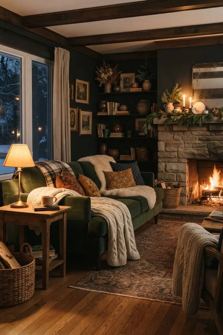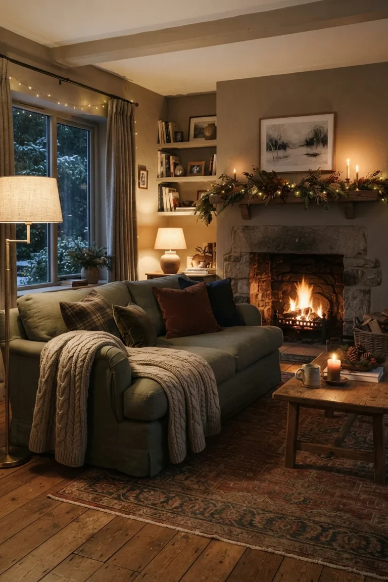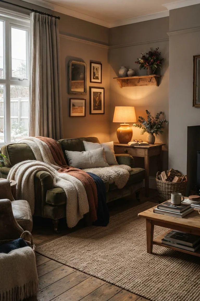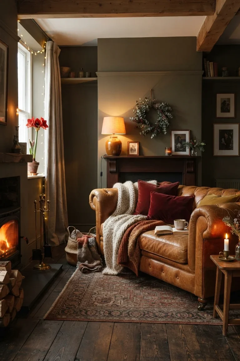
Choosing Colors for Christmas Decor Ideas
One weekend, one 10-by-12 living room, and a tree that has to stand within 3 feet of the sofa: that’s the real brief behind most christmas decor ideas. It’s also why color matters more than the number of ornaments you buy. Settle the palette first and every purchase after that gets easier.
Below are four palette pairings, each built on a specific undertone relationship. After them come a testing routine and a repair plan for when a color choice misfires.
Christmas decor ideas: Mood board breakdown
Every holiday palette comes down to undertones. A red leans blue (cranberry, raspberry) or orange (tomato, fire engine). A green leans blue (spruce) or yellow (moss).
Match the leanings and a room settles. Mix them and something feels off even when nobody can name why. The same advice gets repeated every December, and it’s still the most reliable filter there is.
Cranberry red with spruce green
A tomato-red ribbon tied around a blue-leaning spruce branch looks slightly sunburnt, and that’s the most common mistake with the classic pairing. The fix is matching undertones. Choose a deep cranberry with a hint of blue, then pair it with a gray-leaning green such as Sherwin-Williams Rookwood Dark Green.
This pairing suits rooms with white or pale gray walls and darker wood floors, where it has room to be bold. In a space with yellow-beige walls it fights the paint, and the red turns muddy by midafternoon.
Skip glossy plastic red balls. A 2.5-inch velvet ribbon in cranberry absorbs light and reads deeper than satin, and you can feel the nap catch under your thumb when you tie the bow.
Warm white, oatmeal and brass
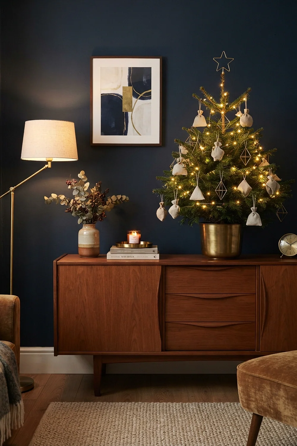
A 7.5-foot tree under an 8-foot ceiling leaves the topper scraping plaster, and tiny 1.5-inch ornaments vanish against that much branch. Neutral palettes depend on scale because there’s no color contrast to carry the display. Go for matte 3 to 4-inch ornaments in oatmeal, ivory and aged brass, and trim the trunk so the tree clears the ceiling by at least 10 inches.
Walls matter here. A creamy white such as Benjamin Moore White Dove keeps all of this soft, while a crisper white makes oatmeal look dingy beside it. A box of 12 oversized matte ornaments runs about $18 to $25, and that one purchase does more than three boxes of small ones.
This works best in small and mid-size living rooms where you want the tree to disappear into the architecture. Avoid it if the room already has beige carpet and beige sofas, because the whole scene flattens into one tone.
Navy with silver and gold
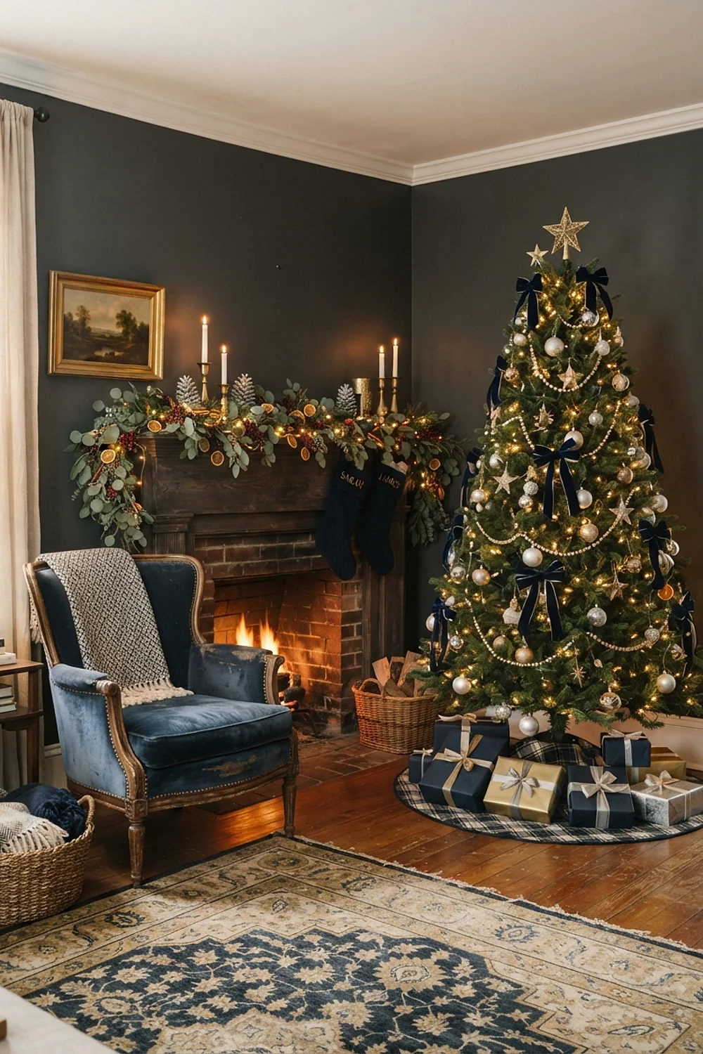
At 4pm in December, a north-facing room goes the color of weak blue tea, and a navy wall such as Benjamin Moore Hale Navy swallows what’s left of the light. Metallics are what rescue it. They catch the lamp glow and throw it back across the dark surface.
Silver beats gold here. Actually, no, scratch that: mixed metals beat either alone, because silver by itself goes cold at that hour and gold by itself turns brassy under 2700K bulbs. Use both, in roughly a 60/40 split.
Bulb temperature is the detail people miss. Warm 2700K string lights make navy glow like a night sky, while 4000K cool white makes it look like a hospital corridor. This palette suits dining rooms and dens, where evening is when the room gets used.
Dusty blush, burgundy and pine
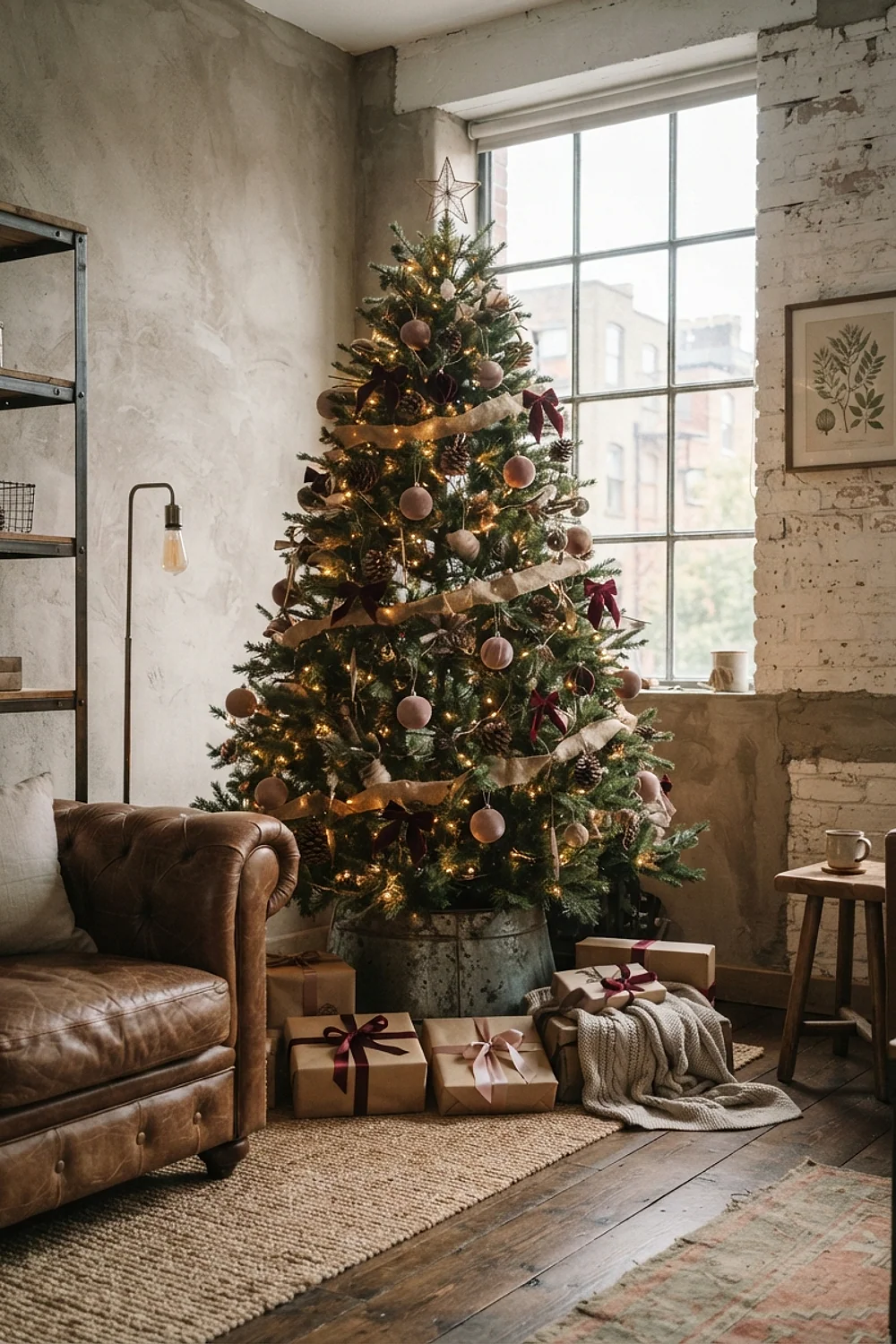
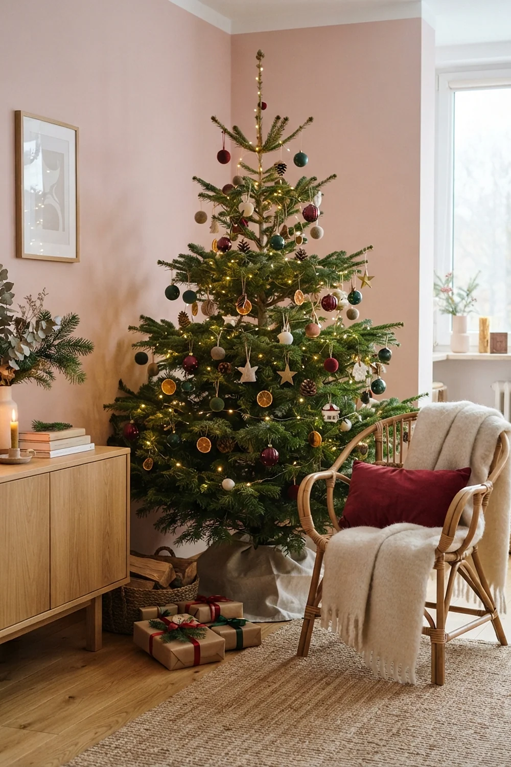
Three zones decide whether this palette looks deliberate: the tree, the mantel and the dining table. Repeat each color in all three, so blush shows up on the tree, in a mantel vase and in a table runner. The eye then travels in a triangle instead of stopping at one pink corner.
Here’s the deal: blush alone reads sweet, and burgundy alone reads heavy. Together, with real pine in between, they balance. A dusty blush such as Farrow & Ball Setting Plaster on the walls makes a good backdrop, with a plum-leaning burgundy for velvet cushions.
A 6-foot faux pine garland costs about $25 to $40 and anchors the mantel. Pick one with a mix of needle lengths, because a uniform needle looks plastic from 3 feet away. This pairing suits bedrooms and reading corners more than a busy family room.
Testing colors before you commit
Christmas decor ideas fail most often at the purchase stage, not the styling stage. A ribbon that looked rich under store lighting turns flat in a room with one window and two lamps. Testing takes about 20 minutes and saves a return trip.
- Bring home one ornament, one ribbon length and one swatch of each color, not the full set.
- Tape them to the wall or tree area and check at 9am, at 4pm, and after dark with the lights on.
- Hold a white sheet of paper beside them to see which whites look yellow or gray.
- Photograph the setup on your phone, then look at it at arm’s length. Small screens exaggerate clashes.
Here’s the counterintuitive part. Warm bulbs make greens read olive and cool bulbs push reds toward pink, so the same ornament box can look like two different palettes in one evening. Always test with the bulbs you’ll actually use.
For paint, a 24-by-24 inch painted board beats a tiny swatch. Move it around the room, because a color beside the fireplace behaves nothing like the same color by the window.
Mistakes that keep showing up
A rainy Sunday afternoon in early December is when most palette problems show up. The tree is up, the lights are on, and something looks wrong. Before returning anything, run through the common causes.
- Too many reds. Pull every red that leans orange and replace it with one blue-based red, or swap it for a neutral.
- Flat, shiny clutter. Remove half the glossy ornaments and add matte or velvet pieces to break up the glare.
- Cold-looking lights. Switch to 2700K warm white strands, which usually cost $8 to $15 per 100-bulb set.
- Competing metals. Pick a dominant metal, keep it at 60%, and let the second one play a supporting role.
If the whole room feels off rather than one corner, the problem is usually the wall color fighting the palette. A throw in the right undertone, a runner, or a few branches of real greenery can bridge that gap without repainting.
And if a single item is the culprit, move it. A clashing ornament tucked deep into the tree’s interior disappears, while the same one at eye level shouts.
Starting points for your space
The best christmas decor ideas start with undertones, not ornaments. Match the leanings, test under real light, and fix problems by subtraction before adding anything new.
Save or pin this list so it’s handy when you start shopping, and try the palette that suits your wall color first. Before buying anything, measure the tree’s height against your ceiling and tape one swatch where it will stand.