8 Guest Bathroom Decor Color Schemes Designers Love
Small rooms, big opinions. A guest bathroom decor scheme has maybe 35 square feet to work with, which means one wrong undertone shows up on every wall, the vanity, and the towels all at once.
This list compares eight specific paint and palette pairings side by side, with the undertone logic behind each. Pick the one that matches your light, your fixtures, and how long guests actually stay.
The color logic behind great guest bathroom decor
Guest bathroom decor works best when the room has one dominant undertone and everything else agrees with it. Bathrooms are full of fixed, unpaintable surfaces: tile, tub, toilet, countertop. Those surfaces already carry an undertone, and the paint has to negotiate with them.
Start by holding a white piece of printer paper against your existing tile. If the paper looks icy next to it, the tile is cool. If the paper looks gray or dingy, the tile leans warm or yellow.
Then think about how long people spend in there. A guest bathroom is a short-stay room, so it can handle a color with more attitude than a primary bath you’d stare at every morning. That’s the counterintuitive part: a dark, saturated wall in a tiny bathroom often looks larger than a pale one, because the corners dissolve and the walls stop announcing where they end.
Three things decide most outcomes:
- Undertone of the fixed surfaces (cool, warm, or neutral)
- Light direction (north light is bluish, south light is golden)
- Bulb temperature (2700K reads amber, 4000K reads clinical)
Eight guest bathroom decor palettes, compared
Sea Salt walls with brushed brass
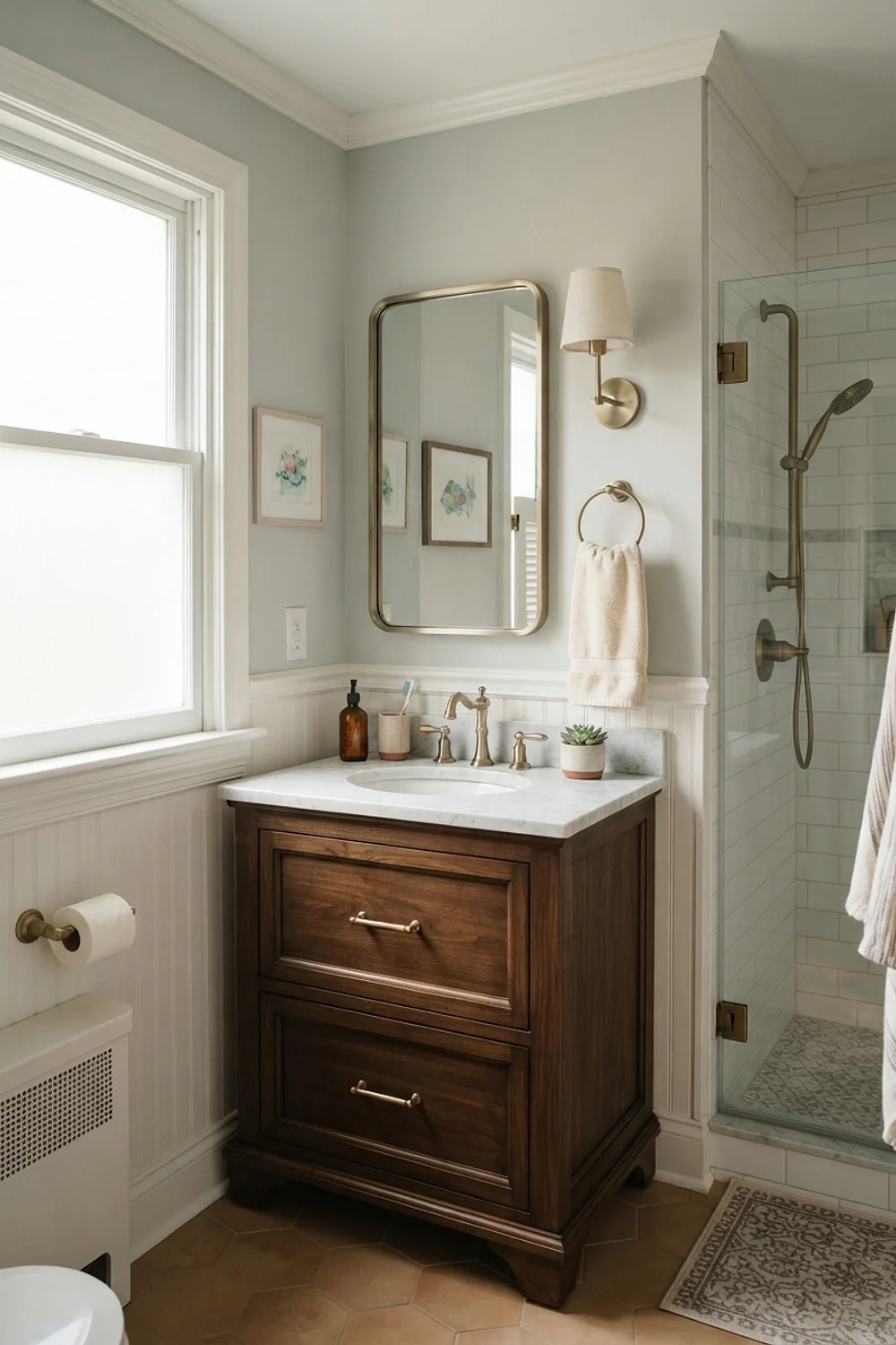
A matte wall in Sherwin-Williams Sea Salt reads as a gray-green on cloudy days and a soft sage when the sun hits it. Brushed brass hardware, which has a satin texture rather than a mirror shine, picks up the warm side of that green without turning yellow.
This suits bathrooms with white subway tile and a window, where the light can shift the color through the day. Skip it if the tile is cream, because the green will make the cream look sallow.
Hale Navy in a windowless powder room
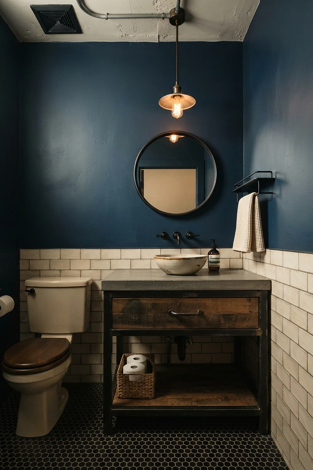
Windowless rooms have no daylight to fight, so a deep color like Benjamin Moore Hale Navy behaves the same way at 4pm as at 9pm. Use a washable finish; Benjamin Moore Aura Bath & Spa runs roughly $85 a gallon and resists the steam from a shower you may only run twice a week.
Pair it with white towels and a round mirror about 24 inches across. The common mistake is adding a second dark color, since navy plus charcoal plus black fixtures turns the room into the inside of a shoebox.
Setting Plaster for rooms under 30 square feet
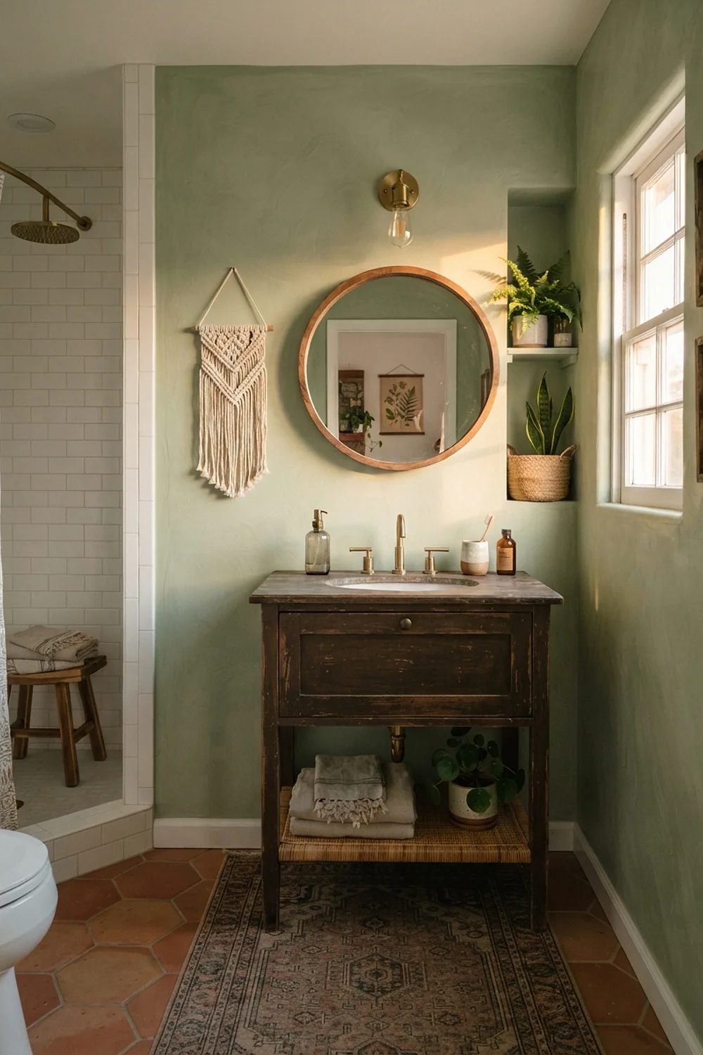
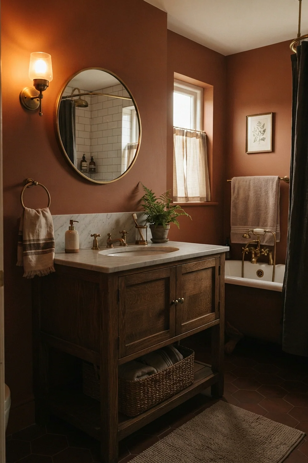
Farrow & Ball Setting Plaster is a pinkish clay that sits closer to skin tone than to anything you’d call pink. In a narrow 5-by-6 bathroom, that closeness is the point: the walls feel like a held breath rather than a box.
It flatters brass, oak, and white marble equally. It fights gray-veined tile, so test it next to the floor before you commit.
Revere Pewter behind open towel shelving

Open shelves above the toilet need a backdrop that won’t compete with rolled towels, so Benjamin Moore Revere Pewter, a true greige, does the quiet work here. Stack towels in two colors at most, such as oatmeal and white, with one wicker basket (about 12 inches wide) for the spare toilet paper.
This is the right call for guests who need to find things without asking. Avoid it in a room with cool blue-white tile, where greige can look muddy.
Accessible Beige under the right bulb
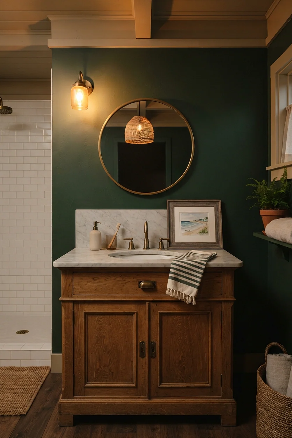
A 4000K bulb is the usual reason a warm beige goes wrong. Sherwin-Williams Accessible Beige is a lovely, slightly gray-leaning neutral, but cool-white LEDs push it toward a hospital corridor.
Swap in a 2700K bulb and the wall turns the color of toasted bread. It’s a ten-second fix that beats repainting, and it’s the better choice for rental bathrooms where the beige countertop can’t change.
Cloud White walls, charcoal vanity
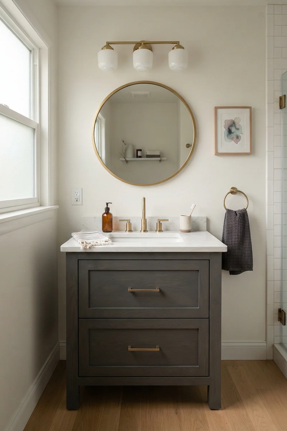
Painting only the vanity is the fastest high-contrast move available, and it keeps the walls light. Benjamin Moore Cloud White on the walls with Kendall Charcoal on the cabinet gives you a clean base and one grounded dark shape.
A quart of cabinet enamel costs about $35 to $45 and covers a standard 30-inch vanity with a little left over. Sand lightly, prime, and finish both coats in one weekend, because half-measures are tempting and a vanity left with one coat looks exactly like a vanity left with one coat.
Evergreen Fog with terracotta towels
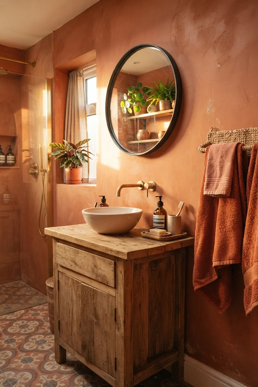
Evergreen Fog from Sherwin-Williams is a smoky, gray-leaning green, and terracotta sits across the color wheel from it. Towels in that burnt orange, plus a small clay soap dish, give the green something to push against.
This pairing suits guests who notice details but don’t want a themed room. Keep the terracotta to about 20 percent of what’s visible, or the room starts to feel like a tropical resort lobby.
Wythe Blue and a wool bath mat
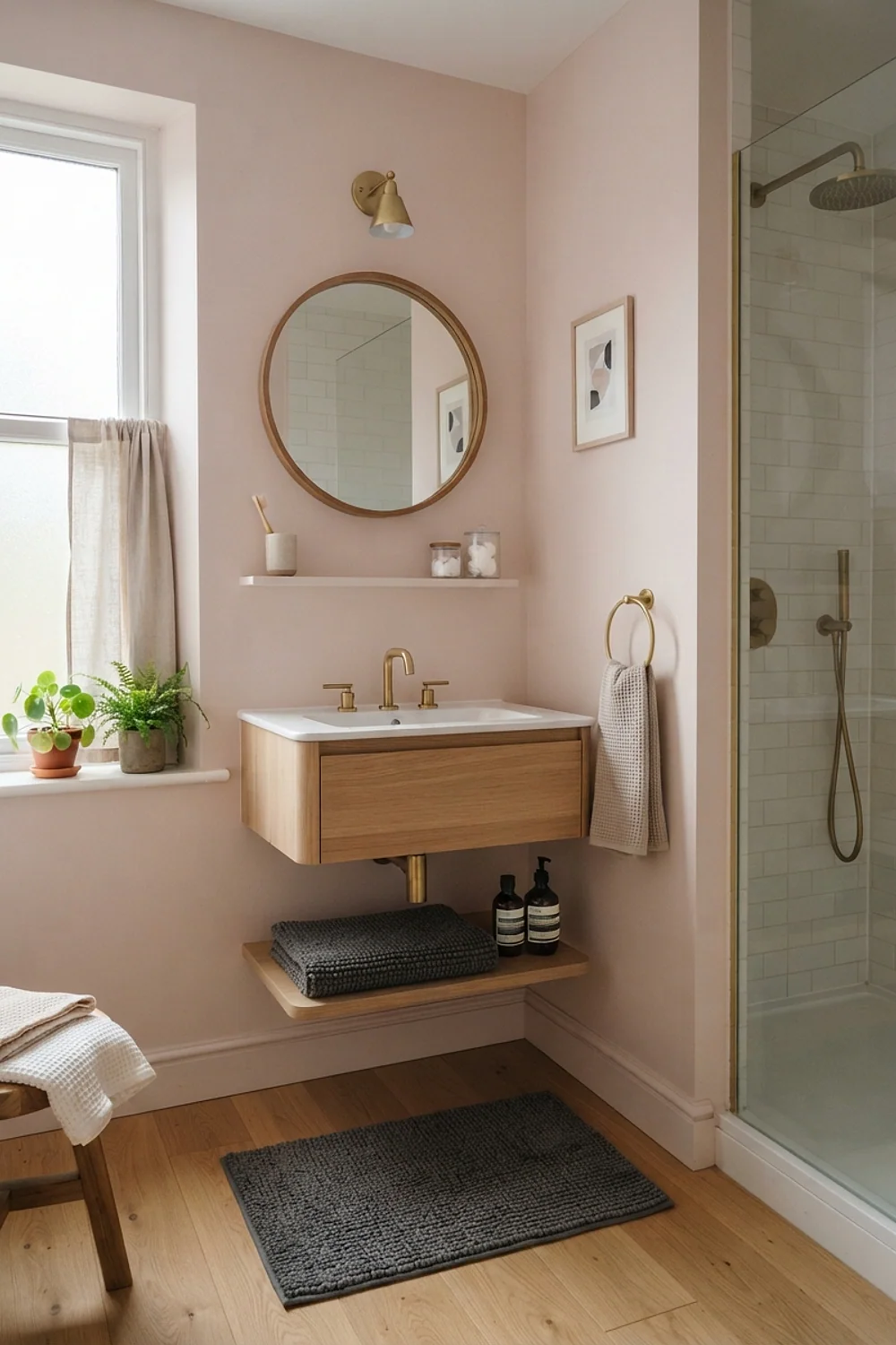
Bare feet on a cold floor change how a color feels, and Benjamin Moore Wythe Blue, a soft gray-blue, can tip chilly if nothing underfoot is warm. A thick cotton or wool-blend bath mat in oatmeal, around 21 by 34 inches, balances it.
This works in northern-facing bathrooms where winter afternoons turn gray by 3:30. Add a warm-toned wood stool or tray so the blue doesn’t carry the whole mood alone.
Testing colors before you commit
Guest bathroom decor deserves a proper swatch test, because bathroom light is unlike any other room’s. A sample card taped up for ten minutes tells you very little.
Paint a 2-foot square on poster board, not directly on the wall, and move it around. Here’s the routine that catches most surprises:
- Paint two coats on white poster board and let it dry fully (about 2 hours).
- Tape it beside the vanity, the tile, and the door frame.
- Look at it at 8am, 4pm, and after dark with the bulbs you’ll actually use.
- Check it wet-adjacent, near the shower or sink, where humidity changes how color reads.
Poster board also lets you slide a color away from a bad spot, which a painted wall doesn’t.
On a rainy Sunday morning, the same swatch can look a full shade grayer than on a sunny Friday. Test on two different days if you can.
What went wrong
A wrong color in a guest bathroom decor plan usually has one of three causes: the undertone clashes with tile, the bulb is wrong, or the finish is too glossy. Diagnose before you repaint.
If the wall looks too cold, change the bulb to 2700K first. That alone shifts the room the way a toaster’s glowing coil warms a kitchen counter.
If the color still fights the tile, add a bridge color: a towel, a framed print, or a shower curtain that repeats one note from each surface. If the wall is simply too dark, a larger mirror (at least 28 inches wide) bounces light back and softens the weight.
Repainting is the last resort, not the first. Do it once, properly, with primer, instead of tinting over it twice.
Choosing your palette and getting started
The eight pairings above share one rule: the wall color, the fixed surfaces, and the bulb must agree on temperature. Cool tile wants Sea Salt or Wythe Blue. Warm tile wants Accessible Beige or Setting Plaster.
Pick the palette closest to your existing tile, test it on poster board in your own light, and commit to a full two-coat job. Save or pin this list so it’s on hand when the paint aisle gets overwhelming, and start by taping one swatch next to the vanity tonight.
Frequently asked questions
What color is best for a small guest bathroom decor scheme?
Soft, slightly muted colors such as Sea Salt or Revere Pewter are the safest, because they work with most tile undertones. A deep navy like Hale Navy also works in a small room if you commit to it fully and keep fixtures simple.
Do dark colors make a guest bathroom look smaller?
Not always. A dark wall blurs the corners, so the room can feel deeper, especially with a mirror and warm lighting. It backfires in a room that already has a dark floor and no light source.
How many colors should guest bathroom decor use?
Three is the practical limit: a wall color, a trim or fixture color, and one accent in the towels or art. More than that and a 35-square-foot room starts to look cluttered.
Which paint finish holds up in a bathroom with little ventilation?
Satin or eggshell in a mildew-resistant formula holds up best. Flat paint absorbs moisture and marks easily, while high gloss highlights every wall flaw.